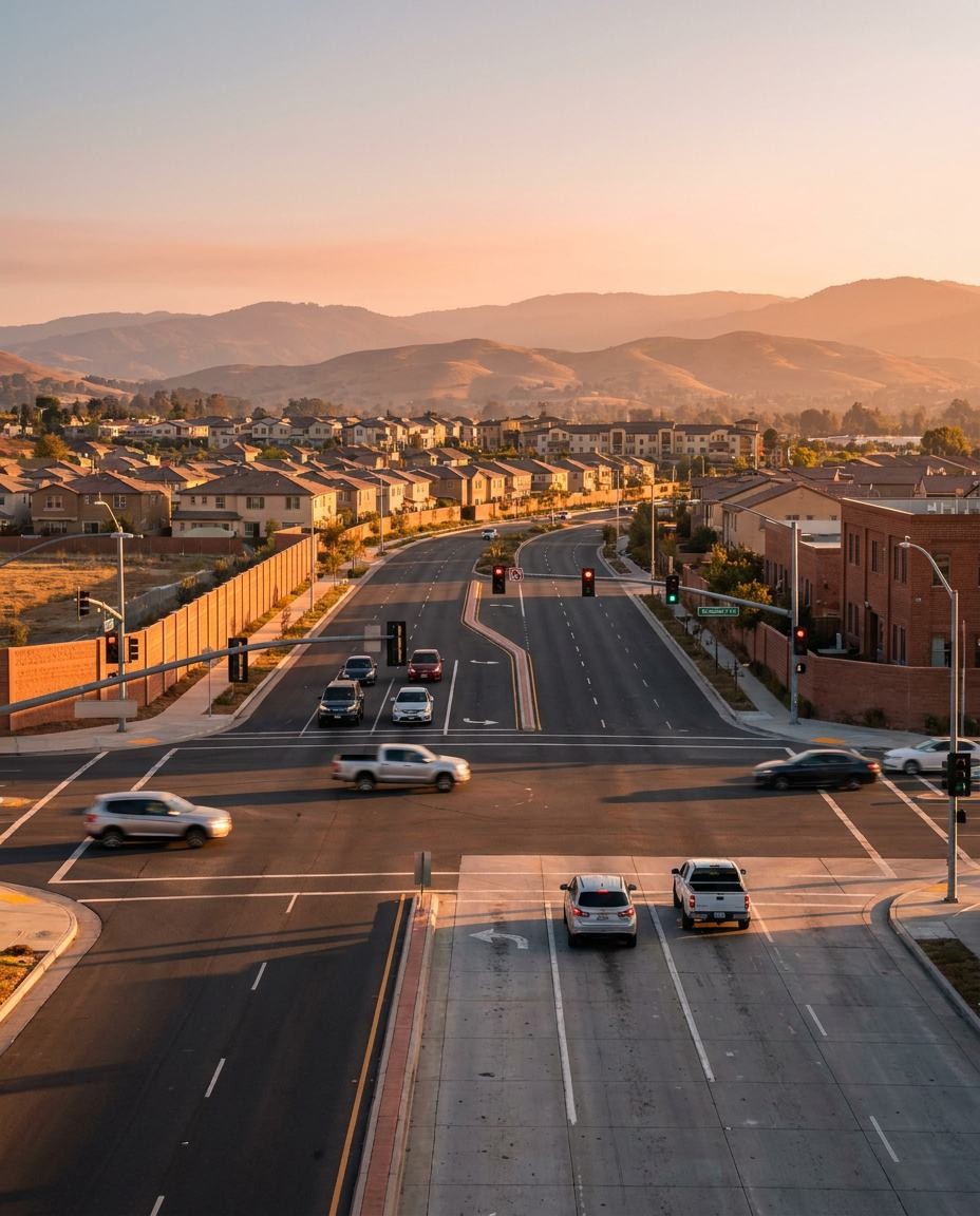
We measured hard braking in 1,223 US counties against what each county’s own mix of trips should produce. The surprises are not in the places you’d expect.
Dense cities feel dangerous.
Traffic, cyclists, double-parked vans, pedestrians who don’t look. The intuition is that urban driving must generate more sudden stops than anywhere else.
It does, in raw terms. The useful question is a different one: does a place generate more hard braking than its own traffic would predict? A county full of slow city streets should produce a lot of braking. The test is whether it produces more than that.
We ran it across 1,223 counties with enough mileage to measure.
New York City comes in low
Manhattan recorded about 30% less hard braking than its trip mix predicts. The Bronx came in 17% below. Cook County, which is most of Chicago, came in 24% below.
70
Manhattan’s braking index. 100 = expected for its trip mix.
100 × (observed / expected) = 70. Δ = −30%.
Three of the densest, busiest driving environments in the country are calmer than their own streets would suggest. The most plausible reading is that constant congestion produces slow, anticipated, continuous driving. Nobody accelerates into a gap on a Manhattan avenue at 4 PM, because there is no gap.
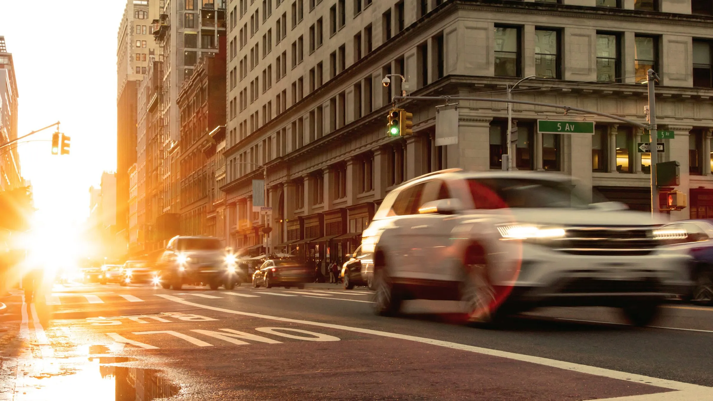
Dense, constant traffic. Manhattan, the Bronx and Cook County all braked hard less often than their trip mix predicted.
The suburbs around New York come in high.
Orange County, New York, ran more than twice its expected rate. Rockland was close behind. Nassau and Suffolk, out on Long Island, both ran well above expectation.
Los Angeles County came in 42% above. San Francisco, San Mateo and San Bernardino were all elevated.
The pattern that emerges is not city versus country. It’s the places where fast roads and local roads keep meeting: commuter belts, arterials with signals and turnings, the stretch between the highway and the driveway.
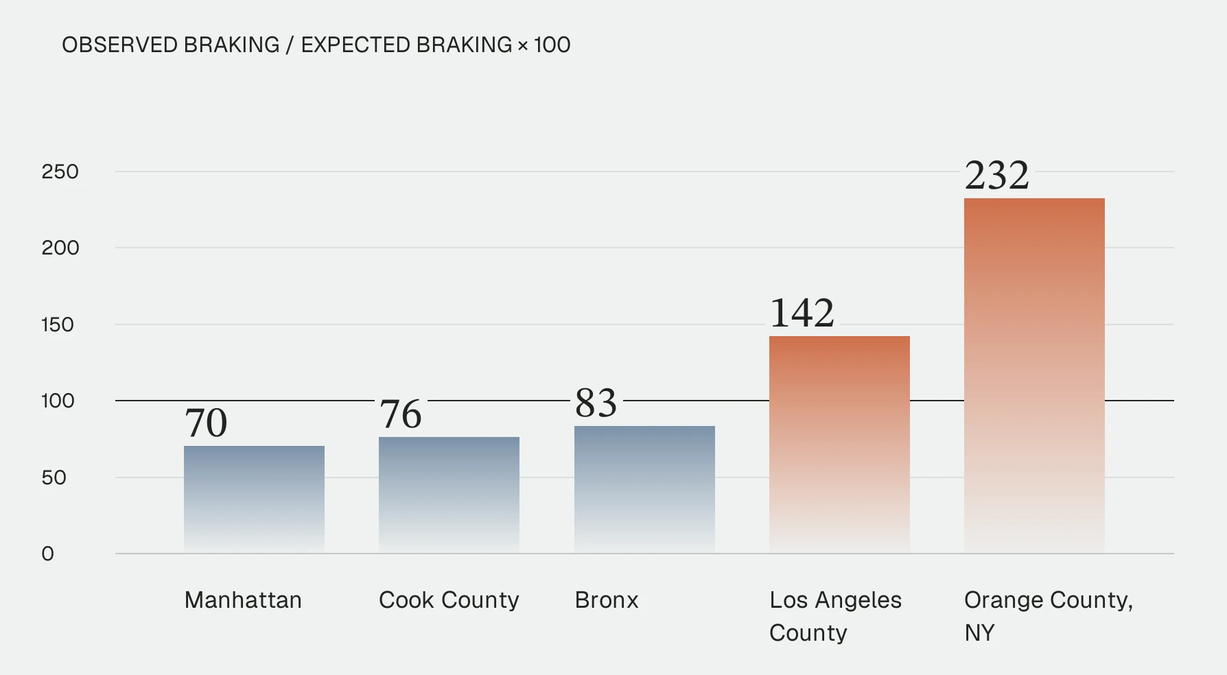
Thin reference line: expected index 100. Cook, Bronx and Los Angeles indices are derived from the rounded percentage differences in the source.
232
Orange County, NY. Highest in the country.
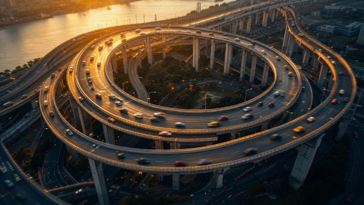
The handover zone: where traffic leaves the highway for ramps, arterials and local streets.
Most places are unremarkable, and that’s a finding too.
Of 1,223 counties we could test, 25 came back meaningfully different from the rest of the country. That’s 2%, which is actually fewer than you’d expect to flag by chance alone.
So the honest headline is that American driving is more uniform than it feels. Adjust for what people are actually driving on, and almost everywhere looks like almost everywhere else. The handful of exceptions are worth a closer look precisely because there are so few of them.
25 of 1,223
Counties meaningfully different from the rest, fewer than chance alone would flag.
423M
Miles measured, October 2025 to September 2026.
More per mile, fewer than expected
Measured a different way, these same counties look different. Per mile driven against the national average, with no adjustment for the kind of driving involved, the dense metros rank among the highest in the country. That isn’t a contradiction. A place can generate more sudden stops per mile than anywhere else and still generate fewer than its own streets would predict.
What we can’t tell you.
Counties are assigned by where a trip started, and a long trip crosses county lines. A vehicle that begins in Rockland and spends the hour in Manhattan counts as Rockland.
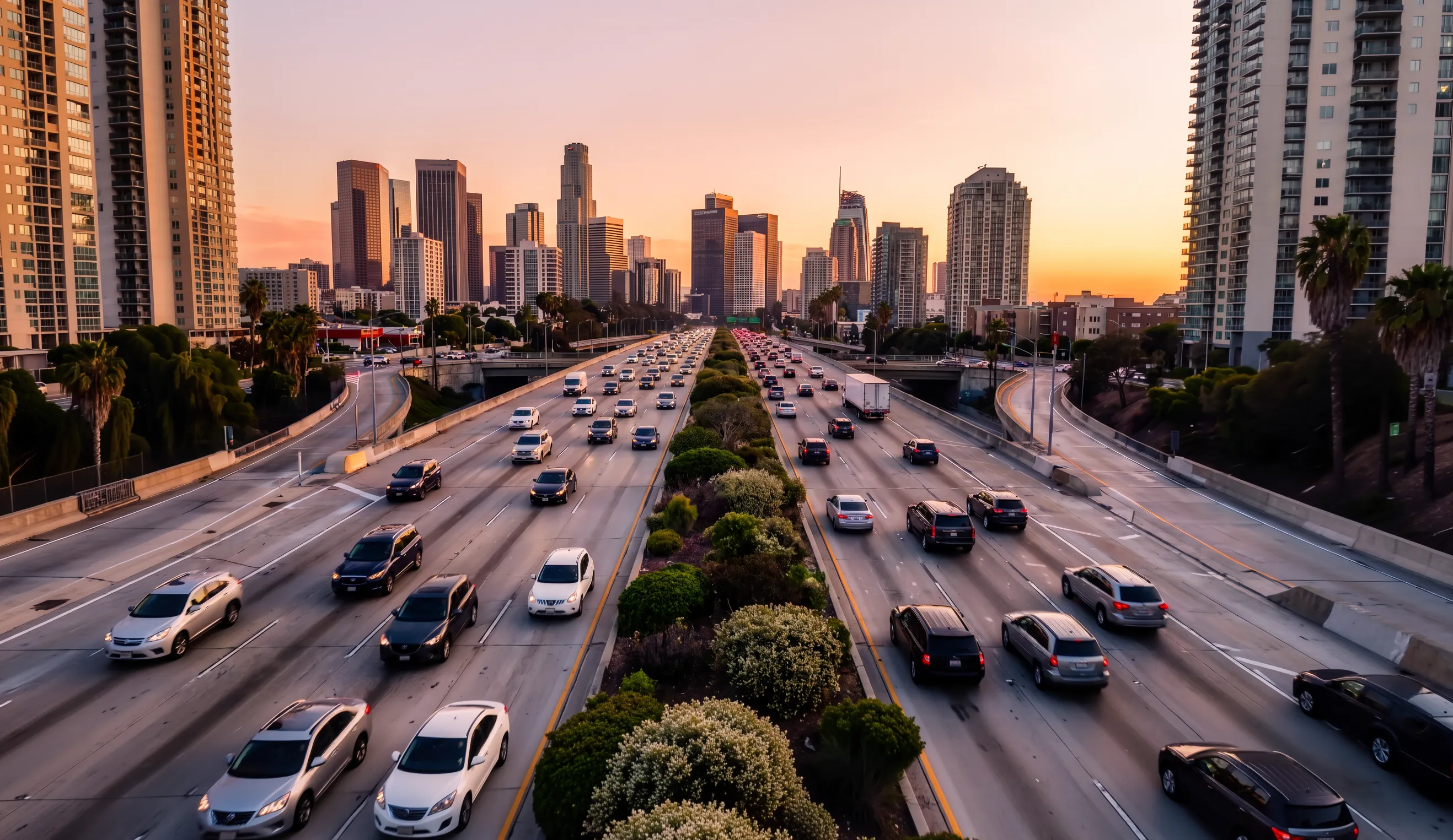
A trip is counted in the county where it starts, wherever it ends.
Hard brakes are a risk signal, not a crash rate. Nothing here says anyone crashed more.
And this is twelve months. A county that looks unusual once is a place to look, not a conclusion.
Source: EE, Safest Million Miles Data Pull Copy, “Counties” tab. October 2025 to September 2026. 423M miles. Editorial adaptation.